|
|
 |
 |

|
 |
 |
Map of the Market
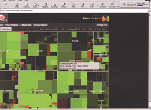
We set out to create a visual answer to the question, “How is the market doing today?” Given the powerful global influence of the U.S. stock market, this question has relevance not just for investors but for anyone seeking to understand the news of the day.
We display the market in the form of colored rectangular tiles, one for each of 600 key U.S. companies. The size of each tile corresponds to a company’s total market value, giving the viewer a sense of perspective and proportion. We represent price movement by shades of red and green, and group similar companies together to help viewers perceive trends. The result is a colorful and intuitive picture in which bright spots in the market show up as literal bright spots on the screen, conveying the mood of the market—and by extension of the economy and the country—at a glance.
Source: Martin Wattenberg / Joon Yu
Cross-reference: The right to reprint is reserved for the press; no royalties will be due only with proper copyright attribution.
 download
printversion download
printversion
 back
back
|
 |
|